When graphic designer meets a friend with a new venture who is brave enough to make a unique logo which makes one pause.

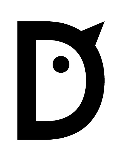
Sometimes you just have to take things literally, if the name of the company is Full Tilt Genomics the tilt needs to be full, in the end it is promised by the name. Being me, of course, I tested other options too, they just didn't look as good and only this one matched both our pugnacious personalities.
Moreover, the company is all about the data and science with lots of math involved, so "T" turning into plus, "I" turning into minus and "L" shapeshifting into reversed not sign (advanced or rarely used logic symbol according to Wikipedia) just add extra flavour to this design.
Thank you Juha for your trust!

Upon finishing the project I thought it would be cool to show the "making of" and this landed on the home page: http://fullti.lt
Also, please take a moment to appreciate this URL.
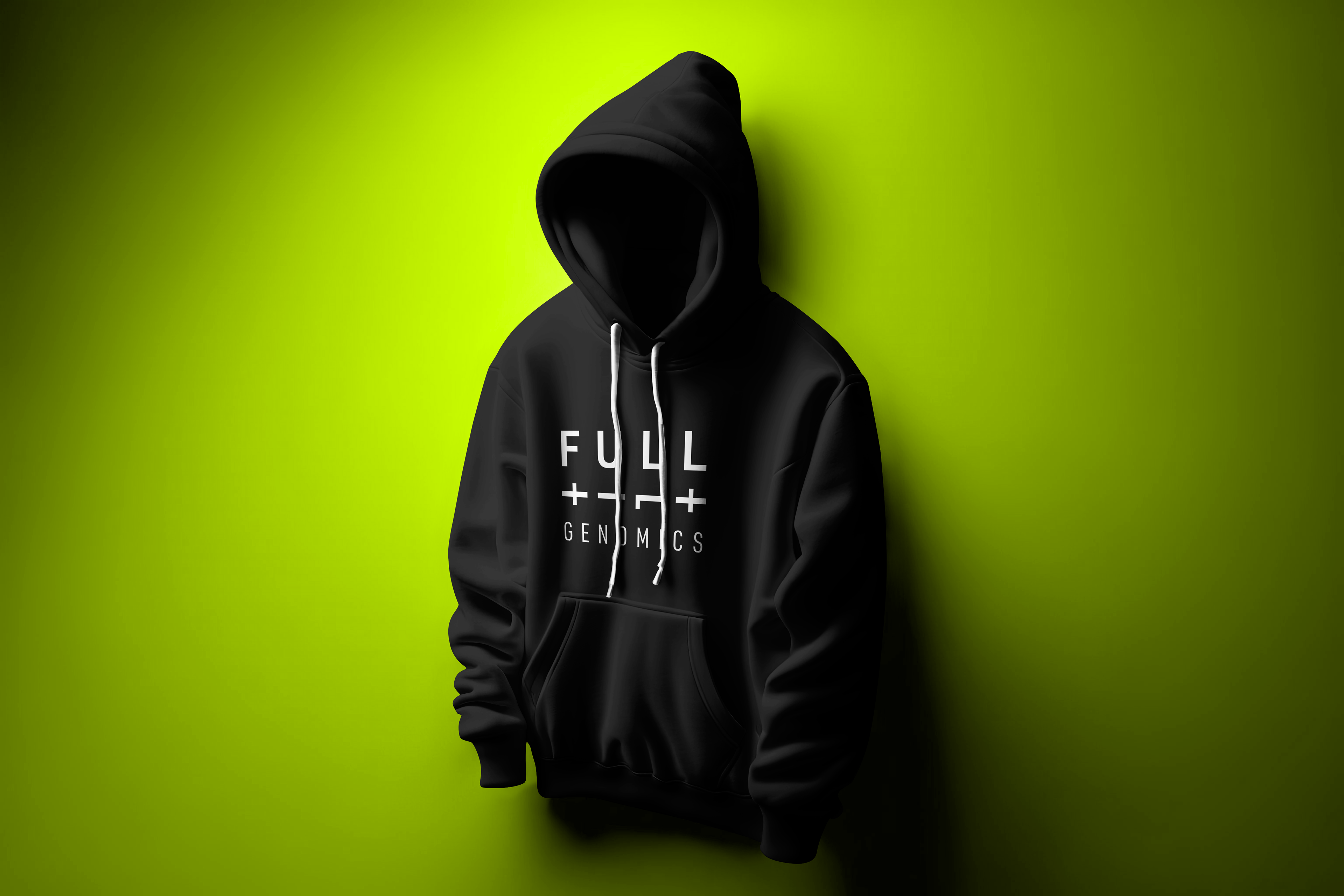
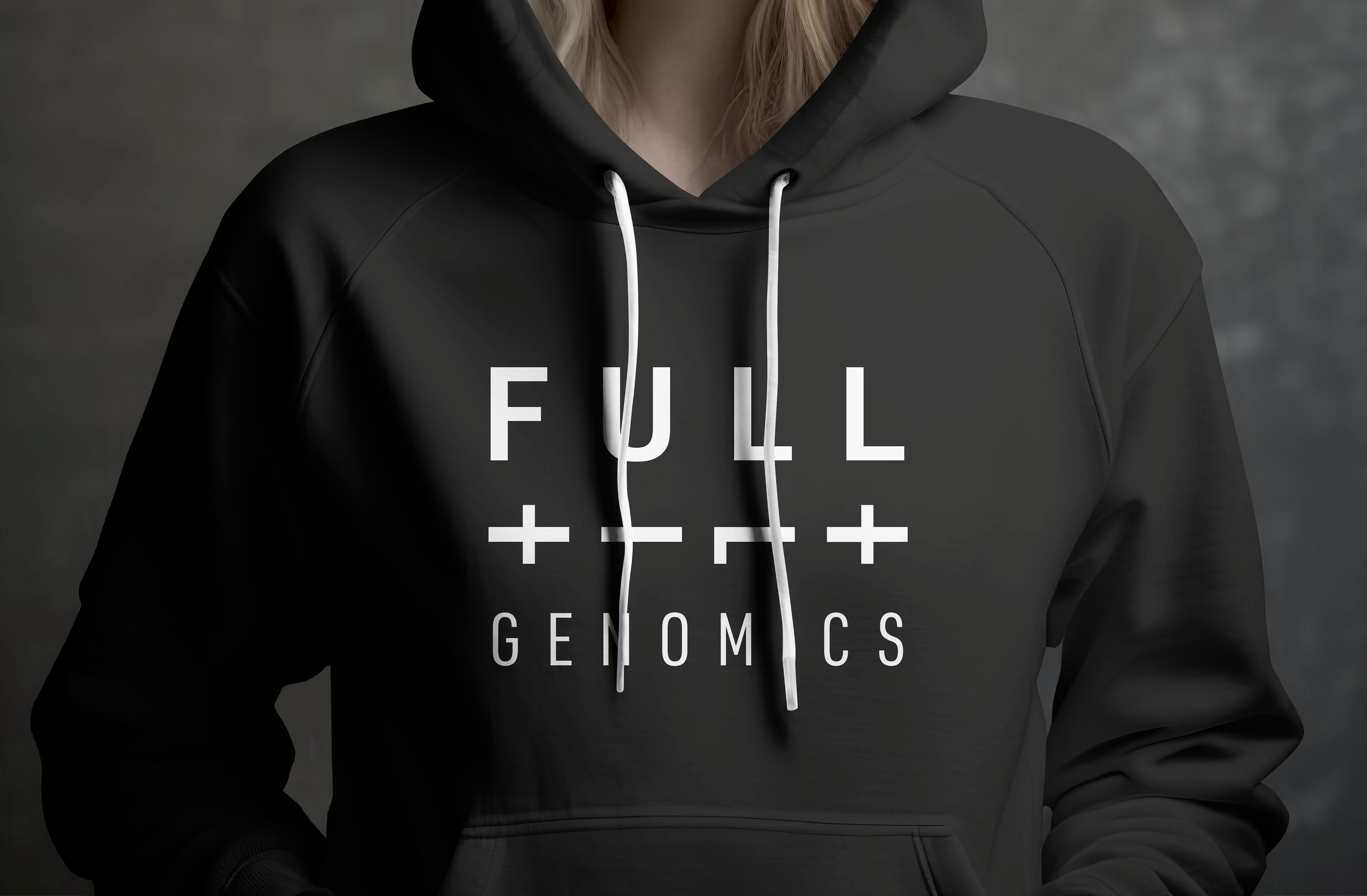
There is so much that can be done with this logo, I just hope to get a hoodie one day, they would be pretty cool!